Week 1: Exploratory Analysis
Our goal is to explain stock market behavior by relying on non-macroeconomic news sources. Using macroeconomic data is an obvious (and previously successful) approach, but using the highly diverse and worldwide event data from our dataset may reveal more interesting explanations for stock market behavior.
Project description
Our goal will be to predict the stock market. As an initial simplification, we will be predicting:
- the end-of-day (close) value of S&P500 (team 1) and commodities (team 2)
- volatility and correlations among assets themselves or between sectors.
Where we use as given given its history and past world event history (looking back N days).
The news source (GDELT) is lagged by one day, and it does not have timestamps for the news. Thus any model that we build can only be applied assuming there is an existing real-time scraper for the data.
The insufficiency in our data source here leads to other interesting directions we can take our analysis - we can train models to be lagged arbitrarily when simulating from historical events (or not at all). The predictive power of all of the models may vary. Thus, if we have time, an interesting third direction we may explore is
- How much weaker long-term predictions (over several days or a month) are given minor delays of information (such as a day).
Previous Work
Previous work as looked at forecasting various financial data with a broad array of techniques from traditional machine learning approaches to finding new feature sets from Wikipedia, Google, and the news.
- Stock Prices, News, and Business Conditions
- Analyzing the effect of news on stock prices: ‘‘Fundamental macroeconomic news has little effect on stock prices… Effect of news… depends on the varying responses of expected flows relative to equity discount rates’’
- Big Data Gets Bigger: Now Google Trends Can Predict The Market
- Using Internet search data to predict pricing data: ‘‘the team found a strong correlation between Internet searches for a company?s name and its trade volume, the total number of times the stock changed hands over a given week… But the Google data couldn’t predict its price’’
- Forecasting Foreign Exchange Rates with Neural Networks
- Visual and Predictive Analytics on Singapore News: Experiments on GDELT, Wikipedia, and ^STI
- Using GDELT ‘‘to highlight the various impacts of June 2013 Southeast Asian haze and December 2013 Little India riot on Singapore’’
- SVM based models for predicting foreign currency exchange rates
- Using SVMs to predict foreign exchange rates
Forecasting Foreign Exchange Rates with Neural Networks
Background
Long position: expect foreign currency to appreciate vs USD, react by buying that currency
Short position: export foreign current to depreciate against USD, react by selling that currency
Actions take place over hours or even minutes
Daily trading volume > $1.5 trillion USD, 24/5
Exchange rates influenced by many economic, political, psychological factors
White 1988 - 2 layer neural network on IBM stocks
Yao et al - backpropagation perceptron and technical indicators can predict six month CHF/USD
Recursive neural networks could work, also diffusion networks
Trading is 24 hours and rates change quickly so we need to fix an arbitrary closing hour and only use an average of the exchange rates for the period between closing
Transaction cost typically 1% of exchange rate, strategies often trade on weekly basis
Data from OANDA.com
Models
Four input models:\
- time-delayed daily averages\
- time-delayed weekly averages\
- progressive averages (6 months back): day before, two days, week, 2 weeks, month, 3 months, 6 months\
- long progressive averages (2 years back)
Cannot just rely on NMSE, need to evaluate models using profit
Profit = (money obtained / seed money)^{52/w} - 1
Two strategies: buying and selling whole amount when increase/decrease predicted, and buying/selling only 10% at a time
Results
Predictions often much lower than real value or lagged behind forex rates
Predicting longer than 6 months is hard (NMSE and profit diverge wildly)
Profit decreases when training model further
Experimenting with large number of currencies without inputting linkage is not good
Best profits achieved with time-delayed 14 daily averages (which was also worst in terms of NMSE)
Long progressive averages model is best for NMSE
Boolean indicators help with NMSE but have no effect on profit
The Data
GDELT
This is a database of worldwide data. Raw data link on GDELT site.
The Global Database of Events, Language, and Tone (GDELT) is the largest, highest resolution, and most detailed open dataset of global human society. It is freely available and uses a variety of international news sources with daily updates, contains more than 250 million events from 1979 to present, is CAMEO-coded (for simple indexing of events) and regularly introduces new enhancements to the data.
To achieve that, GDELT Project monitors the world’s broadcast, print, and web news, from nearly every corner of every country in over 100 languages and identifies the people, locations, organizations, counts, themes, sources, emotions, counts, quotes and events driving our global society every second of every day.
The GDELT provides a knowledge graph that describes not only “what” happened but “how” it happened. Accordingly, as the GDELT Global Knowledge Graph processes each news article it extracts a list of all people, organizations, locations, and themes from that article and concatenates them together to form a unique “key” that represents that particular combination of names, locations, and themes. All articles containing that same unique combination of names, locations, and themes, regardless of how similar the rest of the text is, are grouped together into a “nameset”. The Graph provides a daily intensity weighting which essentially weights each day towards those that occur in the greatest diversity of contexts, biasing towards days with many different contexts being discussed. It is relatively immune to sudden massive bursts of coverage (such as from a major sudden situation) and instead tends to capture the broadest temporal trends. This can be used to evaluate the magnitude of events/turmoil witness each day, in every country.
Data Volume
GDELT releases a raw data file every day that average about 250k rows (approx. 3 rows per second).
Data Schema
The row data file is a csv with around 57 columns that indicate several variables such as the:
- Event CAMEO code
- Date timestamp
- Location
- Link to articles
- Actors involved
The CAMEO code enables for numeric categorization of events. Since the dimensionality of ``events that can occur” is very large, the CAMEO system enables compactification and reduction of this space into something more analyzable. CAMEO improves upon previous event categorization schemes, WEIS and COPDAB. Features:
- It relies on WordNet synsets to automatically codify events
- Supports state and non-state actors, as well as regional and ethnic categorization.
- Location information makes sense in the context of a cameo label
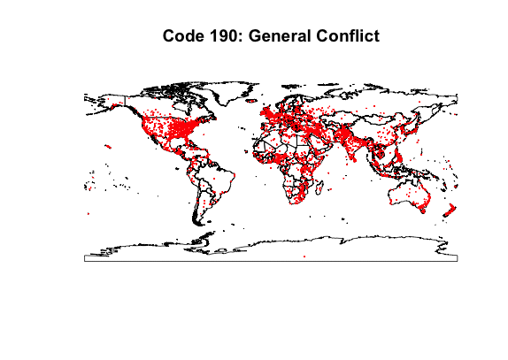

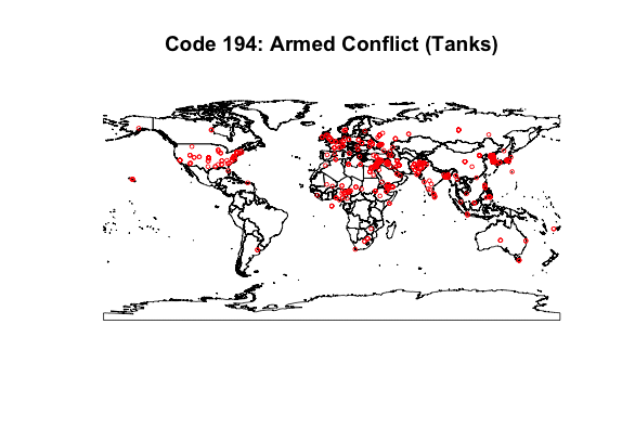
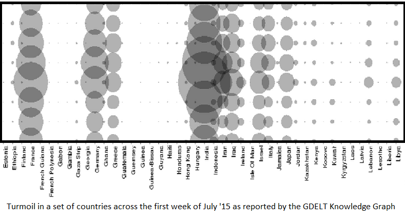
This set of maps shows how news information will intersect with geographic locations. The data plotted is the week of March 1st, 2015. Each dot corresponds to an event labeled with the code indicated. Code 190 represents general conflict data and is useful for seeing the general spread of data. Of note are Brazil, Russia, and China, which either have or report very few conflicts in their news. Code 192 (occupy territory) shows how the labelling of news can be imprecise. Code 194 (armed conflict) shows there there are meaningful local patterns to be found.
Exploratory Analysis
We retrieved stock pricing information from Yahoo Finance for S&P 500 (^GSPC) from January 1, 2005 to December 31, 2005. This data included the S&P’s opening, high, low, closing, and adjusted closing price for each date in this range. We also looked at GDELT data for 2005.
Delving into GDELT
GDELT space is a lot of categorical variables (see below R Exploration section for the exact column names)
cols = {"GLOBALEVENTID", "SQLDATE", "MonthYear", "Year",
   "FractionDate", "Actor1Code", "Actor1Name", "Actor1CountryCode",
   "Actor1KnownGroupCode", "Actor1EthnicCode", "Actor1Religion1Code",
   "Actor1Religion2Code", "Actor1Type1Code", "Actor1Type2Code",
   "Actor1Type3Code", "Actor2Code", "Actor2Name", "Actor2CountryCode",
    "Actor2KnownGroupCode", "Actor2EthnicCode", "Actor2Religion1Code",
    "Actor2Religion2Code", "Actor2Type1Code", "Actor2Type2Code",
   "Actor2Type3Code", "IsRootEvent", "EventCode", "EventBaseCode",
   "EventRootCode", "QuadClass", "GoldsteinScale", "NumMentions",
   "NumSources", "NumArticles", "AvgTone", "Actor1Geo_Type",
   "Actor1Geo_FullName", "Actor1Geo_CountryCode",
   "Actor1Geo_ADM1Code", "Actor1Geo_Lat", "Actor1Geo_Long",
   "Actor1Geo_FeatureID", "Actor2Geo_Type", "Actor2Geo_FullName",
   "Actor2Geo_CountryCode", "Actor2Geo_ADM1Code", "Actor2Geo_Lat",
   "Actor2Geo_Long", "Actor2Geo_FeatureID", "ActionGeo_Type",
   "ActionGeo_FullName", "ActionGeo_CountryCode",
   "ActionGeo_ADM1Code", "ActionGeo_Lat", "ActionGeo_Long",
   "ActionGeo_FeatureID", "DATEADDED", "URL"};
Some Key columns that we are looking at
“Actor1Code”, “Actor1Name”, “Actor1Type1Code” - for identification of actors and their capacity to act
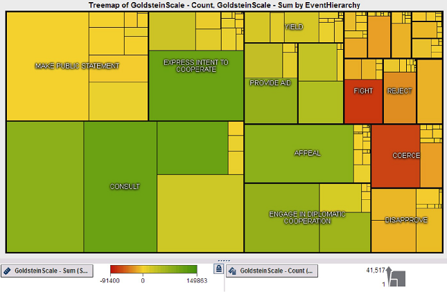
“EventCode”, “EventBaseCode”, “EventRootCode” - hierarchical CAMEO code for event classification (see Event hierarchy chart below)
 Phua, Clifton, et al. “Visual and Predictive Analytics on Singapore News: Experiments on GDELT, Wikipedia, and^ STI.” arXiv preprint arXiv:1404.1996(2014).
“QuadClass” - Material/Verbal Conflict/Cooperation classification
“GoldsteinScale” - Each CAMEO event code is assigned a numeric score from -10 to +10, capturing the theoretical potential impact that type of event will have on the stability of a country.
“NumMentions”, “NumSources”, “NumArticles” - a proxy for the impact of the event y looking at news sources that mention it.
Exploration into actors and relationships
We suspect that there is some lower dimensionality to the data, in the sense that:
- Certain actors only affect a small subset of actors
- Certain actors and regions are subject to particular types of events
However, there’s no easy way of defining a vector space on events - e.g., it doesn’t make sense to subtract the ordinal of event code 030 from event code 010 and calucalte the square of the difference.
Looking at a psuedo random day (March 1, 2015):
Conclusion (1)
Let’s take a look at number of unique “destination” or “receiving” actors, Actors2, for each Actor1, and vice-versa. Note in the following there are a few magic columns: 7 - Actor1Name, 17 - Actor2Name, 28 - EventBaseCode
parseRow[r_] :=
 If[StringMatchQ[#, NumberString], # // ToExpression, #] & /@
  StringSplit[r, "\t"]
csv = parseRow /@
  First /@ Import["~/Desktop/TEMPORARY-GDELT/20150301.export.CSV"]
actors1 = DeleteCases[Union[csv[[All, 7]]], ""];
nActors1[actor_] :=
 Length@DeleteDuplicates@
   Cases[csv, (x_ /; x[[7]] == actor) :> x[[17]]]
LaunchKernels[8]
nActorsByActor1 = ParallelMap[nActors1, actors1];
CloseKernels[]
(* Vice-versa for Actor2 *)
BoxWhiskerChart[{nActorsByActor1, nActorsByActor2}, "Outliers",
 ChartStyle -> {Blue, Red},
 ChartLegends -> {"# Actors 2 per Actor 1", "# Actors 1 per Actor 2"}]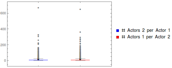
5 number summaries:
n5Sum[x_] := {Text /@ {"Min", "Q1", "Med", "Q3", "Max"}, {Min@x}~Join~
   Quartiles[x]~Join~{Max@x}}
Grid[{Text /@ {"# A2 by A1", "# A1 by A2"}, {Grid[n5Sum[nActorsByActor1]],
  Grid[n5Sum[nActorsByActor2]]}}, Frame -> All]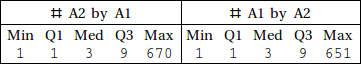
One thing we already notice is that the distributions of actor/actee are pretty identical, so the event interactions are pretty symmetric in terms of frequency of occurences of actors.
So it looks like we have three important segments to take a look at: lower quantiles and the IQR (<75%), 75th quantile up. It looks like we have some peculiar outlier above 400 mentions, but taking a look at what those frequent actors are reveals that the outlier should be considered part of the group, and isn’t a data anomaly:
getTopK[x_, k_] := First@First@Position[x, RankedMax[x, k]]
actors1[[getTopK[nActorsByActor1, #] & /@ Range[5]]]
(* --> {"UNITED STATES", "POLICE", "GOVERNMENT", "PRESIDENT", "UNITED KINGDOM"} *)
actors2[[getTopK[nActorsByActor2, #] & /@ Range[5]]]
(* --> {"UNITED STATES", "GOVERNMENT", "PRESIDENT", "POLICE", "SCHOOL"} *)
An important conclusion here is that it may be useful to scale event importance agains the actor frequency, otherwise US news will unfairly dominate the impact on forecasting, just because news there has higher coverage. We see this is the case for the code 190 event above as well. At the very least it’ll be important to learn the weights for each actors.
Now let’s take another look at the shape of our segmented populations. First the infrequent actors:
infreqBit1 = nActorsByActor1 < 10 // Thread;
infreqBit2 = nActorsByActor2 < 10 // Thread;
Histogram[{Pick[nActorsByActor1, infreqBit1],
  Pick[nActorsByActor2, infreqBit2] },
 ChartLegends -> {"Per A1", "Per A2"},
 PlotLabel -> "# Distinct Actors"]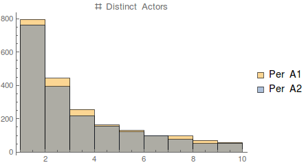
The above is an overlay of the historgrams. Again, very similar distributions, and, as we expect, we have an exponential decay in frequency. For the “infrequent” actors, it seems like events are sporadic, independent, and probabilistic occurences. Another intersting question to ask is among the infrequent actors, how many interactions are with other infrequents?
infreqA1s = Pick[actors1, infreqBit1];
infreqA2s = Pick[actors2, infreqBit2];
Length@Intersection[infreqA1s, infreqA2s]/
  Length@Union[infreqA1s, infreqA2s] // N
(* --> 0.609785 *)
Now for the frequents:
freqBit1 = 10 <= nActorsByActor1 < 400 // Thread;
freqBit2 = 10 <= nActorsByActor2 < 400 // Thread;
Histogram[{Pick[nActorsByActor1, freqBit1],
  Pick[nActorsByActor2, freqBit2] },
 ChartLegends -> {"Per A1", "Per A2"},
 PlotLabel -> "# Distinct Actors"]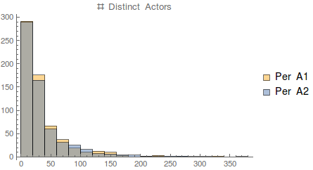
Similar pattern as infrequent actors, perhaps at a different rate of exponential decay.
Conclusion (2)
nEvents1[actor_] :=
 Length@DeleteDuplicates@Cases[csv, (x_ /; x[[7]] == actor) :> x[[28]]]
nEvents2[actor_] :=
 Length@DeleteDuplicates@
   Cases[csv, (x_ /; x[[17]] == actor) :> x[[28]]]
LaunchKernels[8];
nEventsByA1 = ParallelMap[nEvents1, actors1];
nEventsByA2 = ParallelMap[nEvents2, actors2];
CloseKernels[];
Histogram[{nEventsByA1, nEventsByA2},
 ChartLegends -> {"Per A1", "Per A2"},
 PlotLabel -> "# Events by Actor"]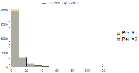
Again, very similar to the actor situation, we find that the event-actor graph is fairly sparse, in that few actors have very many events involved (which gives some indication of a lower dimensionality to the categorical data).
It’d be nice to pursue some kind of dimensionality reduction on the categorical values. This is valuable because a lot of shape and interesting features is hidden in the lower end of the exponential distributions we’re seeing here, and that has a lot of potential for predictive power since it will enable us to distinguish events even when they’re sparse in the context of which actors they occur to.
R Exploration
Import libraries
library(ggplot2)
library(dplyr)
library(tidyr)
library(lattice)
library(quantmod)
Read the GDELT news data from 2005
news_data <- read.csv("gdelt_2005.csv", header=FALSE, sep='\t') # read data
news_data$date <- as.Date(as.character(news_data$SQLDATE), "%Y%m%d")
news_data_ts <- xts(news_data[c("GoldsteinScale", "NumMentions", "AvgTone")], order.by=news_data$date)
colnames <- c() # Same as in Mathematica above
news_data_mean_ts <- aggregate(news_data_ts, index(news_data_ts), "mean")
Read the S&P 500 price data from 2005
price_data <- read.csv("sp500_2005.csv", header=TRUE, sep=',') # read data
price_data <- as.data.frame(price_data)
price_data_ts <- xts(price_data[,-1], order.by=as.Date(price_data$Date))
chartSeries(price_data_ts, name="S&P 500")
Histograms for the Goldstein Scale, Number of Mentions and Average Tone of news articles
# Histogram for Goldstein Scale
ggplot(news_data,aes(x=GoldsteinScale)) + geom_histogram(binwidth=0.5)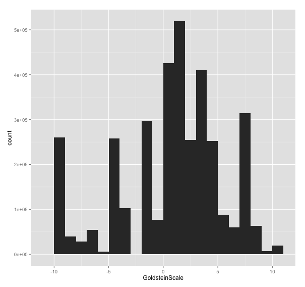
# Histogram for Number of Mentions
ggplot(news_data[news_data$NumMentions<30,],aes(x=NumMentions)) + geom_histogram(binwidth=1)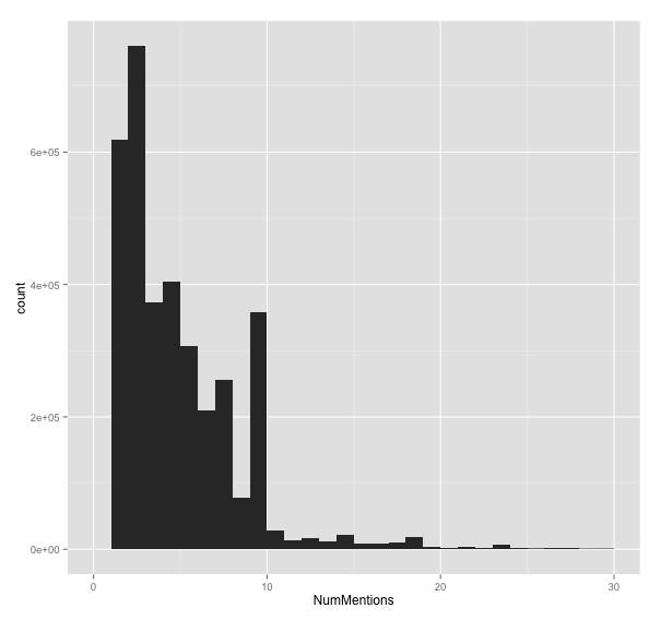
# Histogram for Average Tone
# ggplot(news_data,aes(x=AvgTone)) + geom_histogram()
Histograms for daily return of S&P 500 price
# Histogram for Daily Return
price_ret <- log(price_data_ts$Adj.Close) - log(lag(price_data_ts$Adj.Close, 1))
colnames(price_ret) <- "DailyReturn"
ggplot(price_ret,aes(x=DailyReturn)) + geom_histogram()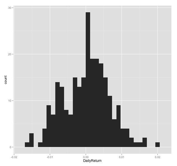
Volume of trading vs Average Number of Mentions
# Volume of trading vs Average Number of Mentions
merged_data <- merge(price_data_ts$Volume, news_data_mean_ts)
plot(coredata(merged_data$Volume), coredata(merged_data$NumMentions))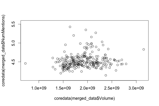
There seems to be almost no correlation between the number of mentions and the price data.
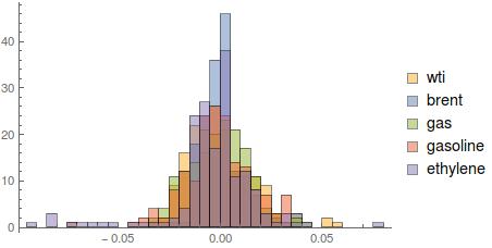
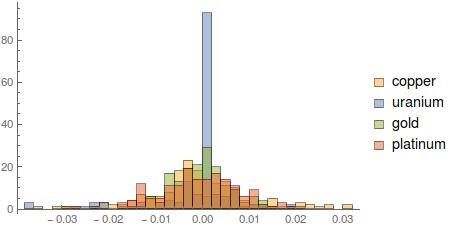
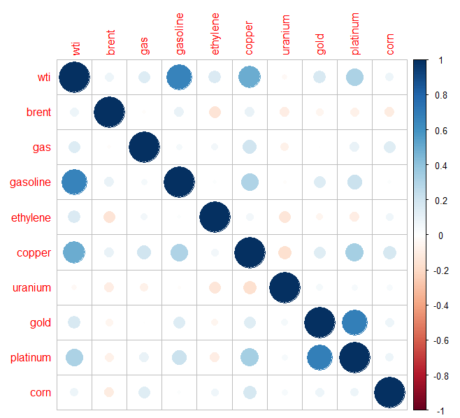
Commodities Exploration